Harmonster: A Display Font for Bold Digital Branding
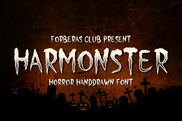
As a web designer who builds landing pages, SaaS dashboards, and conversion-focused online stores, I treat typography like interface architecture—it shapes how users see, scan, and trust what’s in front of them. Harmonster isn’t just another decorative font; it’s a high-impact display typeface built for moments that demand attention without apology. Its jagged terminals, uneven stroke contrast, and subtly asymmetrical letterforms evoke unease and intrigue—perfect for brands that lean into boldness, storytelling, or seasonal identity.
Harmonster excels where clarity meets character: hero section headlines, limited-time offer banners, course sales page headers, and digital ad creatives. It’s not meant for body copy or navigation menus—but when deployed intentionally, it establishes tone faster than any tagline. Think of it as your visual “hook”: the first thing visitors process before they scroll, click, or convert.
Where Harmonster Fits in Real Web Layouts
In practice, Harmonster thrives in short-form, high-visibility contexts:
- Landing page heroes: Paired with a clean sans serif (like Inter or Manrope) for subheadings and CTAs, Harmonster creates immediate hierarchy—your value proposition stays legible while your brand voice feels unmistakable.
- E-commerce banners: For Halloween-themed drops, indie horror merch shops, or limited-edition apparel lines, Harmonster on a dark background with subtle text shadow delivers sharp contrast and mood cohesion.
- Course or workshop headers: Creative educators and coaches use Harmonster to signal uniqueness—especially when targeting niche audiences like digital artists, game designers, or narrative-driven creators.
- Portfolio project titles: On a designer’s personal site, Harmonster adds memorable texture to case study cards or gallery thumbnails without compromising usability.
It works especially well over full-bleed imagery—just ensure sufficient letter spacing (tracking ≥ 50–80 for desktop, ≥ 30 for mobile) and a solid background overlay or stroke to maintain readability.
Readability & Responsiveness: Practical Notes
Harmonster is designed for impact—not extended reading. That means careful handling across devices:
- On mobile, use it only at larger sizes (≥ 36px) and avoid tight line heights. Test on iOS Safari and Android Chrome: some glyph shapes tighten visually on smaller viewports.
- Avoid using Harmonster inside buttons under 44px tall—it loses definition and risks misreading (e.g., “S” vs “5”, “O” vs “0”). Reserve it for primary headline treatments, not interactive microcopy.
- On light backgrounds, apply a subtle 1–2px dark stroke or drop shadow. On dark backgrounds, keep kerning open and consider reducing weight if the font includes variable axes.
- Never stretch or skew Harmonster—it breaks its rhythm and undermines its authenticity.
Font Pairing for Digital Clarity
Harmonster needs typographic grounding. Its personality is strong, so pairing relies on restraint:
- Sans serif companions: Use geometric or neo-grotesque fonts like Poppins, Space Grotesk, or IBM Plex Sans for body text, captions, and CTAs. Their neutrality lets Harmonster shine without competing.
- Serif options: For editorial or premium brand experiences (e.g., a film festival site or horror fiction blog), try a low-contrast serif like Literata or PT Serif—just keep paragraph sizes generous (≥ 18px) and line height relaxed (≥ 1.6).
- Avoid script or handwritten fonts alongside Harmonster—they create visual noise rather than contrast.
Consistency matters: limit Harmonster to one typographic role per layout (e.g., H1 only), and reuse the same pairing system across all branded assets—email headers, social graphics, digital ads—to reinforce recognition.
Licensing, Formats & Technical Fit
Before embedding Harmonster on a live site, verify licensing scope. Most reputable vendors offer webfont kits (WOFF2, WOFF) optimized for fast loading and cross-browser support. Check whether the license covers:
- Self-hosted web use (critical for performance and GDPR compliance)
- Client projects (especially if you’re a freelance UI designer delivering Figma-to-dev handoffs)
- E-commerce platforms (Shopify, BigCommerce, WooCommerce often require explicit webfont permissions)
- Digital templates sold on marketplaces like Envato or Creative Market
Harmonster typically ships with uppercase-only glyphs, stylistic alternates (e.g., alternate “R”, “G”, or “A”), and OpenType features like ligatures—use these selectively in headings, not system UI. No multilingual diacritics are included, so avoid deploying it for non-English headlines unless you’ve manually tested glyph fallbacks.
When Harmonster Strengthens Brand Trust
This may sound counterintuitive, but a display font like Harmonster can increase perceived credibility—if used with intention. Users subconsciously associate confident typography with deliberate brand strategy. A boutique candle brand launching a “Midnight Ritual” collection doesn’t need subtlety—it needs resonance. Harmonster signals that the experience is curated, immersive, and audience-aware.
That said, mismatched usage erodes trust fast. Slapping Harmonster onto a financial dashboard or medical telehealth CTA feels jarring—not clever. Context is everything. Ask yourself: does this screen benefit from emotional punctuation? Does the audience expect stylistic risk? Is the message time-bound or thematic?
When those answers align, Harmonster becomes more than decoration—it becomes part of your design language. It tells users, in under two seconds, that you understand your space, your story, and their expectations.